This ain't your father's Oldsmobile
 More than 2/3 of all Americans now use a smartphone. And as smartphones and tablets continue to become more ubiquitous, the mobile revolution is having a tremendous impact on the public relations industry. The biggest change is obviously reflected in how we view this kind of material in 2014. But that's only the beginning. More than 2/3 of all Americans now use a smartphone. And as smartphones and tablets continue to become more ubiquitous, the mobile revolution is having a tremendous impact on the public relations industry. The biggest change is obviously reflected in how we view this kind of material in 2014. But that's only the beginning.
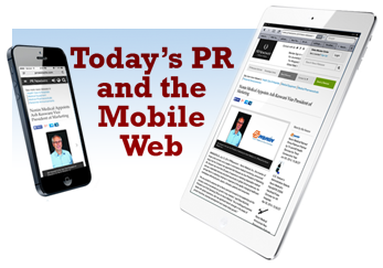
Mobile is the new black.
Web search on mobile devices is growing significantly faster than on desktop devices... as much as 4 times that of desktop computers! Consumers are spending more and more time on their mobile devices, and the smartphone has officially become the primary tool for accessing email, social media, and the internet in general, even within the workplace. For brands, this is huge. Engaged mobile users spend twice as much as those who engage brands through traditional internet. With that in mind, we need to revisit how we produce and distrubute our PR content, making sure that it's easily accessible — and legible — through mobile devices.
Basic requirements for your Mobile Press Release.
- Optimize the text for mobile users. First and foremost, you need to take into consideration the smaller screen size of a smartphone, and — at the very least — use CSS to set-up a style that makes the text sufficiently large as to be easily read on the mobile device. You'll also need to ensure that any "action" you might want your page viewers to take is easily accomplished with typical "one-handed" smartphone interactivity, such as a "touch," a "pinch," or a "swipe." Along those same lines, big fingers and tiny buttons don't go together very well, so plan on using larger buttons for links than what you might ordinarily use within a desktop or laptop environment.
- Say "'no" to multiple pages. For longer articles, mobile users have become accustomed to the vertical scroll, and really don't like to click "next" (or worse, a page number) to get from one page to the next. So a long page of text —albeit one with some subheads or section dividers to make it easier for the reader to see where they are — is preferable.
- Click-to-Call. Another "must have" would be a "click to call" button, one that will enable your viewer to easily place a call to the desired contact within your organization, directly from their mobile device. It's all about making it easy for them to engage with your organization.
- Send them somewhere nice. In terms of engagement, if you've linked within your press release to a page hosted on your company's web site, that page, too, must be developed with the mobile user in mind. Using the same guidelines, make sure that you've styled it with a mobile-friendly style sheet, eliminated extraneous text, and developed a page that is clear, concise, and is both legible and usable from a mobile device.
- Be social. The ubiquity and popularity of social networks is indisputable. Take advantage of it. When folks like what they've read, make it easy for them to share it on their own social networsk, such as LInkedIn, Facebook, or Twitter. One service I use regularly is AddThis, which generates code that can be embedded on your respective pages, to enable one-click sharing of your content. It's quick, painless, and can even be done at no cost, using their basic service. A paid version is also available, and adds reporting and analytics that many business will find to be useful.
Mobile used to be a "trend"... but it's here, now, and ain't goin' away any time soon. The major players in PR distribution, such as BusinessWire and PR Newswire, recognize this, and have already set about to provide responsive, mobile-friendly versions of their distributed content, optimized to be viewed on a variety of mobile devices. Some of the second-tier players have not yet made that leap, so be aware, and choose your distribution services accordingly.
Mobilize your website, too. Now that we've got you thinking about mobile for PR, how mobile-friendly is your website? Try it out for yourself: Use your smartphone and try to navigate your way through a couple of pages or sections. If you find it to be difficult, you can rest assured that your site visitors will, too. And they'll probably not have much patience with it, unless there's something that they absolutely need from your site. When it comes to "mobilizing" your web properties, there are a couple of ways you can approach it.
- Responsive design. You can elect to go with a single website that has been optimized for mobile interactivity, and re-adjusts itself to display properly in whatever type of device from which it's being viewed. This is what we refer to as a "responsive" design, and is the preferred way to ensure that your content is easily viewed on the largest range of mobile devices. Basically, it seperates all of your "content" from how it is displayed and uses Cascading Style Sheet code (CSS) to adjust things like text size, object positioning, and even image sizes, so that they display in a way that looks best on various device types. The good news is that there are many pre-built templates available that can be easily customized to your branding needs, and incorporate well-thought-out style sheets that do most of the work for you. Templates such as these are available in both basic HTML and Wordpress formats, among others.
- A "dedicated" mobile site. The other alternative is to create a "dedicated" mobile site that takes your content and strips-away much of the code that defines how it is normally displayed. It's then up to the individual device to display text in whatever default settings are used on your device. News services such as Reuters and the New Your Times were early proponents of this approach, though most have since opted for much more robust, responsive sites. This approach can be handled quickly with relative ease, utillizing a third-party subscription service such as bMobilized, which will provide a mobile-ready version of your site in just minutes, and costs as little as $16 per month to maintain.
Time is money.
Whichever way you choose to go with your mobilization initiative, don't wait. Mobile users are an impatient lot, and if they find your content to be difficult to accses or to navigate, they'll go elsewhere. And once they're gone, they're a lot harder to win back! Also, be sure to test your work, and on the widest variety of devices likely to be used by your audience. Use your own smartphone to see how easy (or difficult) it is to navigate your site, and adjust accordingly. Lastly, use an analytics tool like Google Analytics to look at metrics such as "bounce rates" specifically for your mobile visitors. This'll tell you if your page or website is as mobile-friendly as you want it to be. If it's not, keep making incremental adjustments.
It's very likely that mobile users will be overtaking desktop users
within just the next couple of years. Make sure that you're ready for them!
Questions or comments? contact Dave Orban or call (609) 586-4286.
|